Green and grey form one of the most versatile color pairings in bedroom design. The earthy warmth of green balances the cool neutrality of grey, creating spaces that feel both restful and intentional. Whether someone’s planning a full renovation or just refreshing bedding and accents, this combination adapts to nearly any style, from modern minimalism to cottage charm. The key is understanding how different shades interact with light, existing finishes, and personal taste. This guide walks through practical ways to layer green and grey into a bedroom, from wall treatments to textiles, with specific product types and material choices that make the difference between a Pinterest board and a finished room.
Table of Contents
ToggleKey Takeaways
- Green and grey bedroom ideas work because green reduces eye strain while grey adds sophistication, creating spaces that are both restful and intentional without feeling sterile or trendy.
- Choose green and grey shades based on your bedroom’s lighting: light-filled rooms handle darker greens with charcoal grey, while north-facing spaces need pale sage or mint alongside warm greys.
- Layer your bedding starting with neutral grey sheets, add a green duvet cover, and mix throw pillows and blankets in both colors to build visual depth and comfort.
- Painted accent walls, vertical stripes, or wainscoting are practical wall treatments that work for green and grey bedrooms in rentals or spaces where full commitment feels risky.
- Pair your color scheme with upholstered headboards, wood furniture in walnut or light oak tones, and metallic accents in brass or copper to add warmth and prevent the space from feeling cold or flat.
- Reinforce your green and grey palette with floor-length curtains, area rugs, real plants in ceramic planters, and botanical artwork to complete a cohesive, relaxing bedroom design.
Why Green and Grey Work Perfectly Together in Bedrooms
Color theory explains why this pairing succeeds: green sits opposite red on the color wheel, while grey acts as a true neutral that doesn’t compete. This creates visual calm without the sterility of all-white schemes or the heaviness of darker monochromes.
From a practical standpoint, grey grounds vibrant greens (like emerald or chartreuse) and elevates muted ones (sage, olive). It also hides dust and minor wear better than white or beige, a bonus for bedrooms with textured fabrics or upholstered furniture.
Psychologically, green reduces eye strain and promotes relaxation, hospitals and wellness spaces use it for a reason. Grey adds sophistication without the coldness of stark whites. Together, they suit light sleepers, people working from bedrooms, or anyone wanting a space that feels collected rather than trendy.
This combo also plays well with existing finishes. Brushed nickel hardware, natural oak floors, and white trim all complement green and grey without requiring replacement. That saves budget for where it counts: quality paint and textiles.
Choosing the Right Shades of Green and Grey
Not all greens and greys match well. Light levels, existing flooring, and personal preference all dictate which shades work.
Light-filled rooms handle darker greens (hunter, forest) paired with medium or charcoal greys. North-facing bedrooms or spaces with small windows do better with pale sage or mint greens alongside warm greys (those with slight beige or taupe undertones).
Test paint samples on all four walls before committing. Colors shift dramatically between morning and evening light. Buy 8-ounce sample jars and paint 2×2-foot squares. Live with them for 48 hours, checking how they look at wake-up and bedtime.
Undertones matter. Cool greys (those leaning blue) pair with blue-greens like teal or eucalyptus. Warm greys work with olive, moss, or yellow-greens. Mixing warm and cool tones creates visual tension unless intentionally going for an eclectic look.
Popular Green and Grey Color Combinations
Here are proven pairings that work across different lighting conditions:
- Sage green + greige (grey-beige blend): Soft, approachable, suits traditional and transitional styles. Works in low-light rooms.
- Charcoal grey walls + emerald accents: Bold, modern, needs ample natural light or bright white trim to avoid feeling cave-like.
- Pale mint + dove grey: Airy, feminine without being juvenile. Good for smaller bedrooms or those doubling as dressing areas.
- Olive green bedding + slate grey walls: Earthy, masculine, pairs well with wood furniture and leather accents.
- Forest green accent wall + light grey on remaining walls: Creates a focal point without overwhelming. Position the dark wall behind the bed for maximum impact.
Many designers reference color psychology and bedroom trends when selecting palettes that balance aesthetics with restfulness.
Green and Grey Bedroom Wall Ideas
Wall treatment sets the foundation. Here are specific approaches:
Painted accent walls: Use green on the wall behind the bed, grey on the other three. This works in rentals or spaces where full commitment feels risky. Apply two coats of satin or eggshell finish paint for easier cleaning than flat.
Vertical stripes: Alternate 12-inch or 16-inch stripes of green and grey using painter’s tape and a level. This elongates walls visually, helpful in rooms with standard 8-foot ceilings. Measure and mark before taping: uneven stripes look unintentional, not artistic.
Wainscoting or board-and-batten: Paint lower panels grey, upper walls green (or vice versa). The divide typically sits 32-36 inches from the floor. This approach suits traditional or farmhouse styles. Use primed MDF boards for wainscoting in non-humid climates: they’re easier to cut and less expensive than solid wood.
Textured finishes: Limewash or clay-based paints in grey create subtle movement that pairs well with flat green bedding or curtains. These finishes require specific prep, seal raw drywall first, and don’t use them over glossy existing paint without sanding.
Wallpaper: Patterns incorporating both colors save decision fatigue. Botanical prints, geometric designs, or abstract watercolor effects work. Peel-and-stick options exist for renters but don’t hold up long-term on textured walls. For permanent installations, use wallpaper paste rated for the paper weight.
Always prime walls before painting, especially when going from dark to light colors or covering repairs. Stain-blocking primer prevents bleed-through from old marks or patched areas. Allow 24 hours of dry time between primer and topcoat.
Furniture and Bedding Selections for a Green and Grey Bedroom
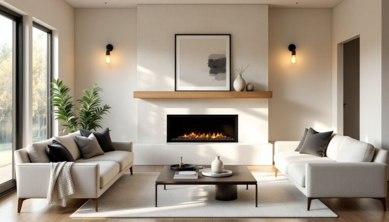
Furniture either anchors the color scheme or gets lost in it. Upholstered headboards in grey linen or velvet create a soft focal point without adding bulk. For DIY builds, use 1×6 pine boards as a frame, add 2-inch foam padding, and wrap with fabric secured via staple gun on the back.
Wood tones affect the overall mood. Walnut or espresso finishes add warmth to cool grey walls. Light oak or whitewashed wood keeps things airy with darker greens. Avoid orange-toned wood (like cherry) unless going for a retro vibe, it clashes with most modern greens.
Bedding layering builds depth:
- Start with a grey fitted sheet and flat sheet in cotton percale (crisp) or sateen (smooth). Thread count between 300-400 balances durability and softness.
- Add a duvet cover in green, solid for bold walls, patterned if walls are neutral. Linen duvet covers wrinkle naturally and suit relaxed styles: cotton resists wrinkles better.
- Layer a textured throw blanket in the opposite color at the foot of the bed. Waffle weave, chunky knit, or faux fur all work.
- Mix pillow shams and throw pillows in both colors, varying sizes (euro, standard, lumbar).
Dressers and nightstands don’t need to match the color scheme if they’re in neutral wood or painted white. Grey-painted furniture works but can fade into grey walls, add contrast with brass or matte black hardware.
Consider storage needs when selecting furniture. Beds with built-in drawers reduce clutter, which helps organizing bedroom spaces more effectively in smaller layouts.
Accent Decor and Finishing Touches
Accessories tie everything together without permanent commitment.
Curtains and window treatments: Floor-length curtains in either green or grey add height. Hang rods 4-6 inches above the window frame and extend them 8-12 inches beyond each side for a fuller look. Linen or cotton-blend fabrics drape better than synthetics. Blackout linings help light sleepers.
Rugs: A wool or jute area rug in grey grounds the space. Layer a smaller green accent rug at the bedside for warmth underfoot. Rug size matters, aim for at least 8×10 feet in a queen bedroom, with 18-24 inches extending beyond each side of the bed.
Lighting: Swap builder-grade fixtures for intentional choices. Matte black or brushed brass pendant lights flanking the bed replace traditional table lamps and free up nightstand space. Dimmer switches (easy DIY install if the existing switch box has a neutral wire) let users adjust ambiance.
Artwork and mirrors: Frame botanical prints in simple black or natural wood frames. Oversized mirrors in grey or metallic frames reflect light and make rooms feel larger, hang opposite windows for maximum effect.
Plants: Real greenery reinforces the color scheme. Snake plants, pothos, or ZZ plants tolerate low light and infrequent watering. Use grey ceramic or concrete planters to tie into the palette.
Adding Texture and Patterns
Flat color needs dimension. Introduce texture through:
- Linen curtains with natural slub
- Velvet throw pillows in emerald or charcoal
- Woven baskets for storage (seagrass or rattan in natural tones)
- Quilted coverlets instead of smooth duvets
- Shiplap or tongue-and-groove paneling painted grey
Patterns prevent monotony but require restraint. Stick to a 60-30-10 rule: 60% dominant color (usually grey), 30% secondary (green), 10% accent (patterns or metallics). Mix pattern scales, pair large-scale botanical wallpaper with small-scale striped pillows.
For those working with limited square footage, many of these textile and storage strategies overlap with techniques for organizing small bedroom spaces without sacrificing style.
Metallic accents in brass, copper, or matte gold warm up cool grey tones. Chrome and nickel keep things modern but can feel clinical without enough wood or textile warmth. Switch out drawer pulls, curtain rods, and lamp bases for an affordable refresh.
Interior designers often share additional styling techniques and room inspiration that demonstrate how layering textures creates visual interest without clutter. Other resources like Home Bunch provide real-world examples of color coordination in finished spaces.
Safety note: When installing curtain rods or hanging heavy mirrors, locate studs with a stud finder and use appropriate anchors. Drywall alone won’t support more than a few pounds. Toggle bolts or molly bolts rated for the item’s weight prevent accidents.